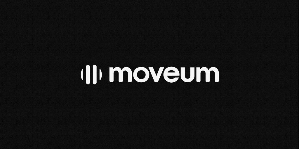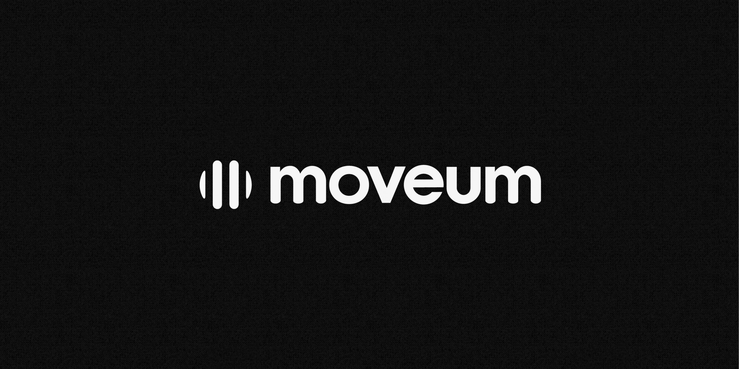
During my time as Marketing Coordinator at Moveum, then known as Athena Nordic, the company decided to change its name and develop a new visual identity. I was involved in the process alongside an external design agency, and after plenty of ideas and different concepts, we eventually settled on a logo I had designed.
The name Moveum is a made-up word meant to represent movement and progress. I wanted to capture that idea in the symbol, so I started with the letter M, mirrored it and placed the two shapes facing each other inside a circle.
The idea was to create something that could be interpreted in different ways. The circle might bring to mind the Earth or a ball in motion, while the shapes together also form a stylized person in a wheelchair. That last detail felt particularly relevant since Moveum specializes in home accessibility adaptations, and many of its customers use wheelchairs.
I wanted the logo to be simple and easy to recognize, but still have a little more to it than meets the eye. The fact that it also connected the company’s new name with what they actually do was something I particularly liked about the final result.