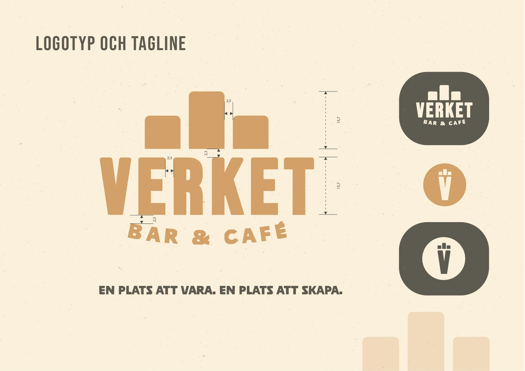
Verket is a concept for a youth-run bar and café in Flemingsberg, designed as a meeting place for culture, creativity and community. The project was a group assignment where one of my main responsibilities was designing the logo.
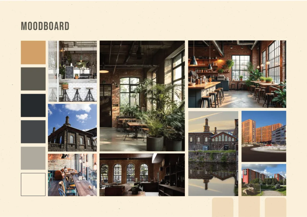
The concept took inspiration from Flemingsberg’s architecture and industrial character. The idea was to create a place where the raw, somewhat rough surroundings could meet something warmer, more creative and welcoming. That contrast also became the starting point for my logo design.
I wanted the logo to capture the meeting between the industrial and the creative. Something that felt bold and confident, but still had a softer, more inviting side.
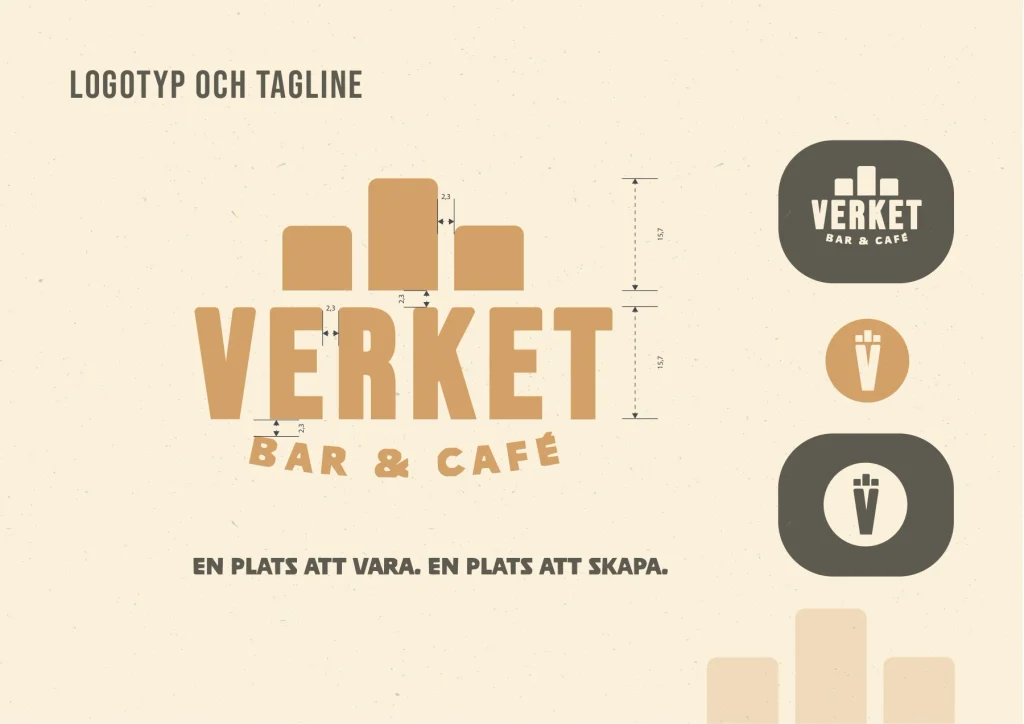
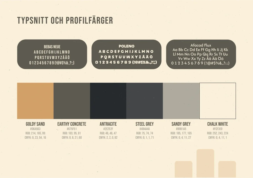
I started with the typeface Bebas Neue, whose strong, straight letterforms suited the look I was going for. To give the logo a character of its own, I modified the letters by rounding off their upper sections while keeping the lower parts straight and angular. This contrast became a way of visually bringing the harder and softer elements together.
Behind the wordmark, I added three stylized pillars that form a simplified skyline. The inspiration came from Flemingsberg’s tall buildings and concrete-heavy surroundings, but also from older industrial buildings and their distinctive window shapes. I liked how this connected the area’s architecture with the name Verket, while allowing the same shapes to appear in both the symbol and the typography.
Below the wordmark, I placed the text Bar & Café in a slightly curved arrangement, using the typeface Poleno Medium. At first, I considered leaving it out, but I felt it actually added something important. The softer, more playful typography created a nice contrast with the bold wordmark and made the overall design feel more welcoming.
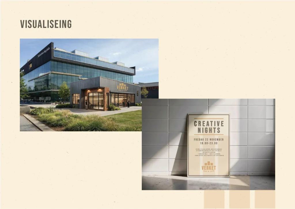
I also wanted the logo to work in different settings, from signage and printed materials to websites and motion graphics. That’s why I paid particular attention to keeping the shapes clear and recognizable, making sure the logo would still work at smaller sizes and in black and white.
Project Brief:
A group assignment focused on developing a visual identity for an existing concept, with particular attention to the target audience, brand identity and visual communication.
We started by developing two different design directions, which were presented and evaluated before choosing one to develop further. The final result had to include a cohesive visual identity with a logo, typography, color palette, imagery and slogan, along with mockups showing how the concept could be used across different platforms and materials.
An important part of the process was considering the target audience’s needs and explaining how our design choices supported the concept’s purpose, message and overall visual identity.